Being in the middle of the Digital Transformation means being in the midst of a multifaceted change process. Although the first challenges that might pop up in your head relate to leveraging new technologies or upskilling your existing workforce, the most fundamental and often underestimated success factor is that your corporate culture and organizational design need to be geared towards agility and support this change where it matters most: among the people who will make this change happen through their day-to-day actions.
Creating and establishing new habits is at the core of any change process, whether it’s a personal one where you try to lose weight or a professional one where you want to be more productive at work or establish norms and values within a team. It all comes down to creating new habits successfully, which helps you achieve your objectives and basically operationalize the willingness to implement new and different behavior.
Designing new habits is, for me, one of the most interesting design challenges of all, and it has a lot to do with data, analytics, and really good data visualization. When you think of the blueprint of a new habit, you can break it down into three fundamental components: triggers, routines, and rewards. Triggers ensure being reminded of the new behaviour you want to implement, routines help you simply execute consistently what is required to achieve your objectives, and ultimately, the reward helps you stay motivated and go through the pains of change.
Data Visualization plays a key part in implementing successful triggers, routines, and rewards because there is nothing more powerful than showing humans real data about their behaviour, the progress they make, and how far they are still away from achieving what they want. If you get the Data Visualization right, it will resonate deeply with the humans who want to implement the new habit, and it will inspire action and the desired change naturally.
This can be done in a personal and professional context alike! Let’s take a look at a simple but extremely effective example of Data Visualization, which has all the key ingredients you need to change the behaviour of human beings.
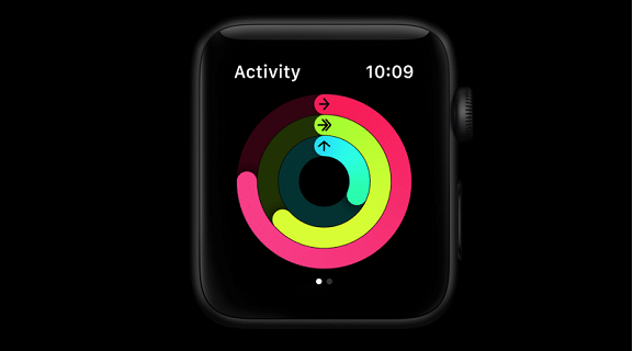
The three Activity rings of the Apple Watch.
They have the potential to go down as one of the biggest change enablers for personal health in human history, and they are so successful because they qualify for the same three success factors to leverage Data Visualization for Digital Transformation. Each of these factors is universal and can be applied in this very personal context of an Apple Watch, but also to the Digital Transformation process many corporations go through right now.
The three Activity rings of the Apple Watch.
The three rings — Apple is asking millions of people to close every day — measure your movement, training, and standing time. But your objective is to become healthier! Good KPIs to determine if your health has actually improved over time would be things like your change in BMI, resting pulse, or cholesterol level. So why are the rings not showing that directly?
While these are good indicators for your underlying goal, they are relatively slow-changing and complicated to measure, and therefore not suited to drive the adoption of a new habit. For Data Visualization to be powerful in supporting a transformation process, you have to select the right metrics for Visualization first.
Selecting actionable proxies translating the change you need to implement is key. How much you move, train, and stand every day is one key part of the equation to live a healthier life. While only representing a part of the bigger picture, we know that people who make progress on these metrics will also quite likely improve other required behaviours like improving their nutrition.
What is great about these proxy metrics are basically three things:
Data Visualization can fuel a transformation process and keep it going if the Visualization is constantly triggering and rewarding people to establish new routines. This will only work out if we visualize metrics we can actually influence, measure, and see progressing frequently.
While the Apple Watch has picked three great proxy metrics to help form new habits that help you achieve the underlying goal to live a healthier life, it also managed to choose one single visualization that is reduced to the max and focused on progress.
During the day, you will check your watch multiple times, and you can answer within a second without a lot of computing in your brain three key questions:
All these three things are essential to optimize the routines connected to this new habit. We not only get triggered and rewarded, we can adopt our routines to actually achieve what we need to achieve, as we know immediately where we are, where we need to act, and how far we still have to go.
Depending on the watch face you select, you will see the three rings progressing dozens of times a day, and they will fire triggers for your change process without thinking about it by just moving your wrist and taking a look at your watch to check the time or a notification.
It’s probably the most simple and powerful embedding of a Data Visualization into Day-to-Day life you can possibly think of, which is key to its success. You don’t need to unlock your phone, open an app, navigate through it, and check out different graphs or use any filters or drop-down. It’s right there where you need it and helps you to form your new habit.
Three aspects in the design process of a powerful Data Visualization that can support your change process are key, therefore:
You obviously never design anything in isolation, but you always think of the context of where and how something gets used. That is no different for any Data Visualization and becomes even more important when the underlying objective is to form new habits, to unlock change, and support your Digital Transformation.
Any form of digital transformation will change not just the technologies in use and the skills required, but more importantly, it will need a whole organization to be rewired. No matter if you transform your Marketing, Sales, Products, Business Model, Recruitment, Procurement, Collaboration, or any other area of your business: you will bust silos like crazy, confront your organization with new ways-of-working, with an increased and sometimes unwanted transparency, with the possibility to automate new processes, which might be right now other people’s jobs, and you need to evolve first and foremost, quite likely, your corporate culture, which is the ground in which you plant the digital transformation seeds.
You will need to break this change down into new structures, behaviours, objectives, and in the end, new habits, and I can only encourage you to see Data Visualization as one of the key tools to help drive this change and unlock your digital transformation.